Apple OS 26 Public Beta First Impressions
Some quick thoughts after the weekend with Apple’s OS 26 public betas (primarily iPad OS). Here's a selection of new features, how they work, how some of them are broken, and where does it leave the OS as a whole.
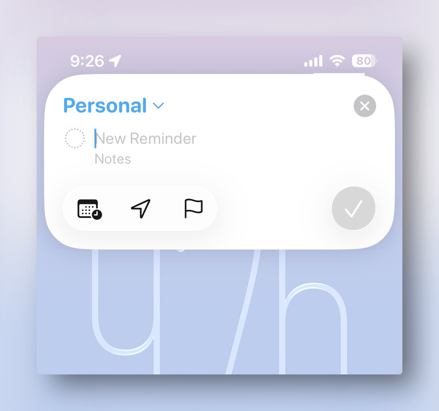
Add Reminder quick action from the lock screen is a convenient addition. I already use it a lot, on my iPhone in particular. It will likely replace Remind Me Faster for me.
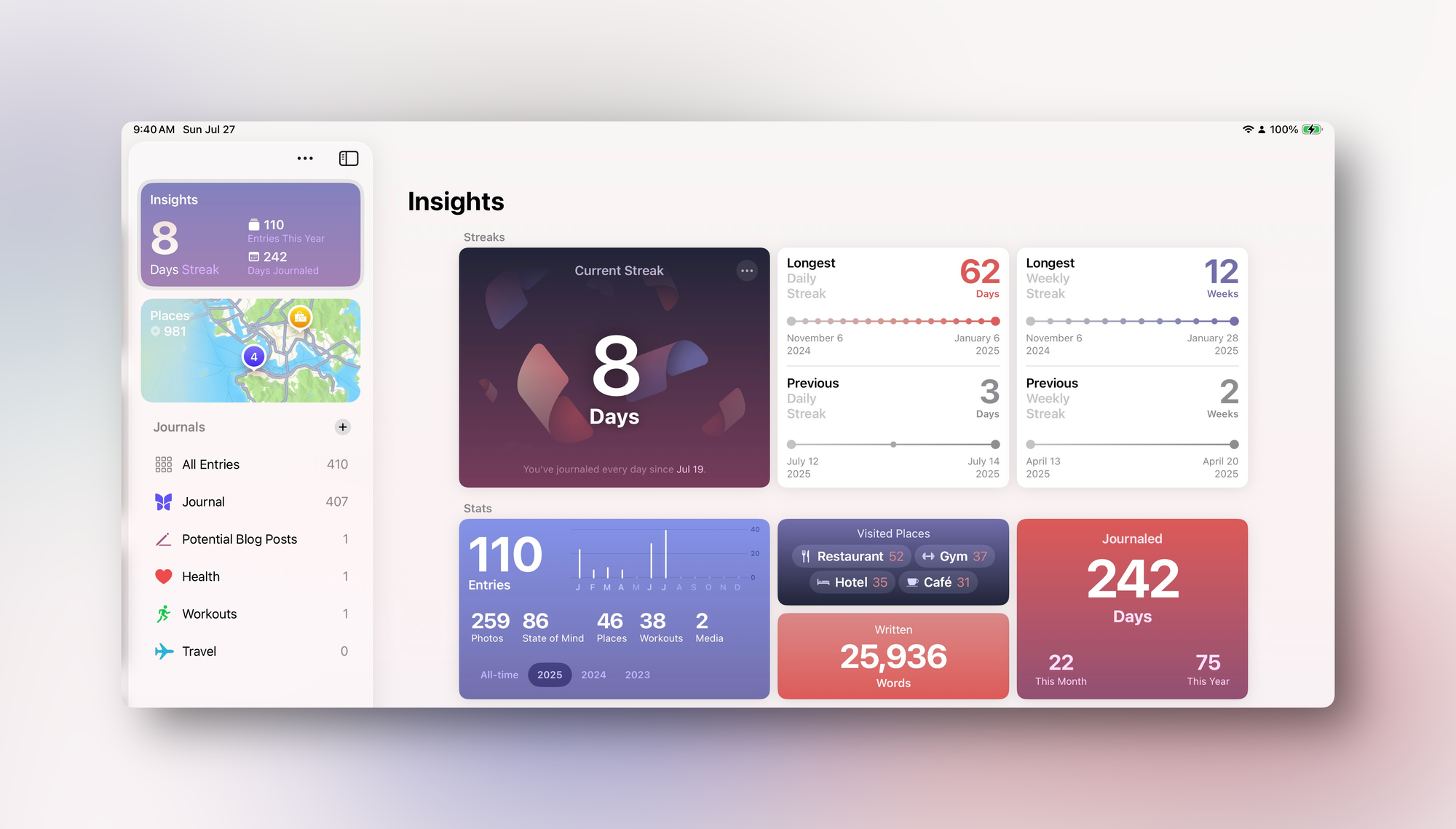
Journal got some nice improvements, but it’s buggy. I was looking forward to finally trying it on the iPad. iPhone has never been a place for mindful reflection for me. Somehow, I need a keyboard or a pen(cil) for that. And now that the app is finally cross-platform, I can start seriously considering it for my everyday journaling.
Thing is, it’s the buggiest Apple app I’ve seen on this beta:
- Syncing journaling suggestions seems to happen only on Wi-Fi.
- Sync seems broken in general. Changes, even entire entries don’t sync reliably across devices. That doesn’t inspire confidence to store my memories in Apple Journal.
- The way it handles handwriting is just not good. Something’s wrong with the way it calculates the position of the “drawing” object as it goes all over the place when you change the device’s orientation, the app’s window width, or hide/reveal the sidebar. I have also seen reports of Apple Pencil input lag, but haven’t encountered it myself.
- [edit: day later] Oh no, LJPUK was totally right. After putting more than a couple of lines of handwriting into Journal everything slows down to a crawl. The Pencil becomes laggy and the whole app becomes unresponsive. If you were thinking of doing your handwritten morning pages in Journal on the iPad — I'm sorry to report, but it's totally unusable.
- You can create new, separate journals now. But if you try to recategorize your old entries into one of those new ones you’ve just created, your selection will revert after a couple of minutes (syncing error?).
- The longer the entry gets, the more laggy the typing experience becomes.
- And it still doesn’t have on this day — a feature which is critical for me.
So now I have to choose between Journal, Day One, and Obsidian for my daily journaling. It’s hard! — and the trade-offs are real: security, data portability/ownership, attachment handling, UX, etc. And moving years of entries from one app to another is way harder than moving some to-do’s between productivity apps! I'll keep agonizing over this, I'm sure.
Other than that, I noticed small bugs here and there but nothing major.
Liquid Glass is a miss for me. Some elements look nice, but it definitely does not achieve its goal of “interface just gets out of the way and leaves more room for your content”. If anything, it’s the opposite. It’s distracting. It’s like it’s shouting “hey, look at me and all the cool effects I can do!”. Yeah, light refractions are cool for the first 5 minutes, but then it would be nice to be able to read what’s on the buttons and panels. Liquid Glass makes it harder!
The switches between light and dark modes on the interface elements based on what’s behind it are also jarring. Things that were easily accessible before, now require additional taps (e.g., “all tabs” view in iOS Safari). Options are less visibile and more difficult to reach. That's not what I expect from a well-thought-out UI!
No. It’s making my devices look more toy-like and harder to use at the same time. Form over function at its “finest”. That's very bad!
Safari looks awful on some websites.
App icons look straight bad on some backgrounds.
I’m still getting used to the new windowing system on the iPad. I like how with Stage Manager I can create separate spaces (e.g. a separate three-column view with all my social media), but now the stages peek out from the edge of the screen (if you’re in a full-screen app like YouTube) all the time. That is distracting (and unnecessary?).

I like that Command+Shift+/ keyboard shortcut works with the new menu bar on the iPad.
Haven't tried the LLM model action in Shortcuts yet. Looking for a good use case.
Overall, I don't think I like where Apple is going with this. There are a few nice conveniences, but the new design language doesn't work for me, and features both new and old seem very buggy (yes, even for a beta). Here's to hoping that things improve before official release.
Member discussion